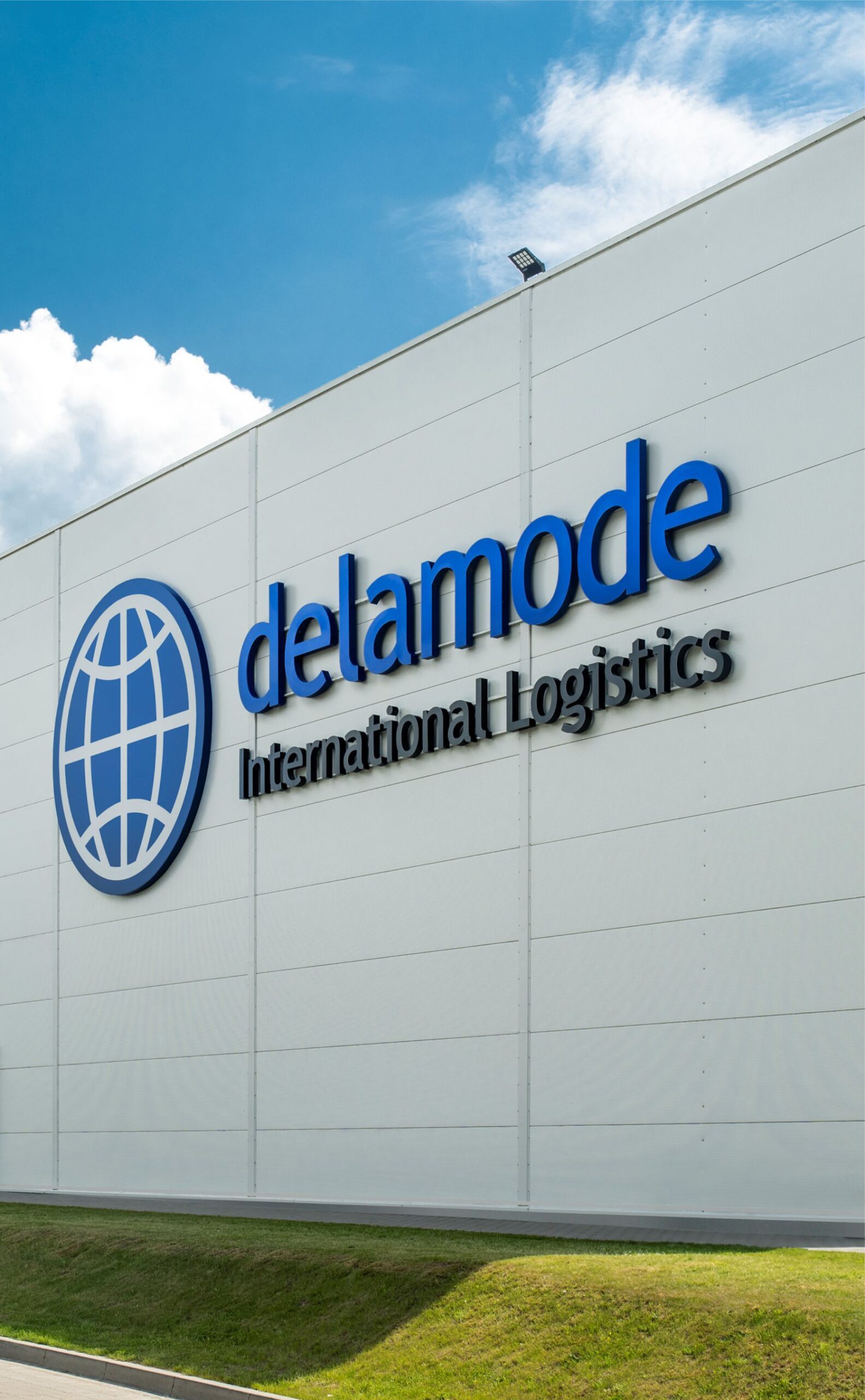
DELAMODE firminio stiliaus atnaujinimas


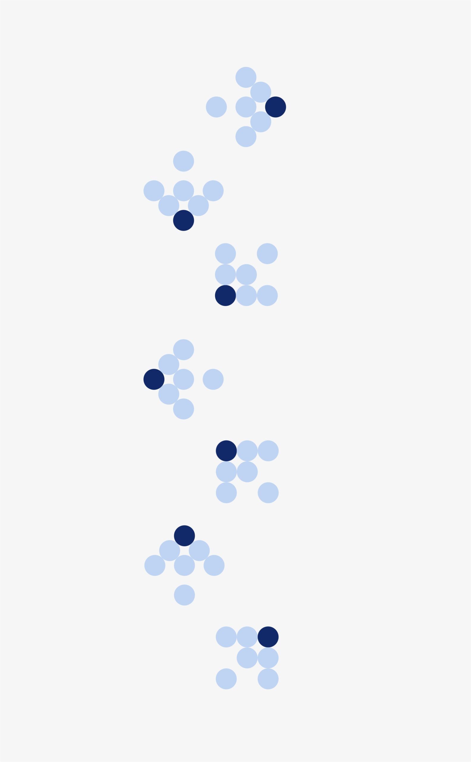
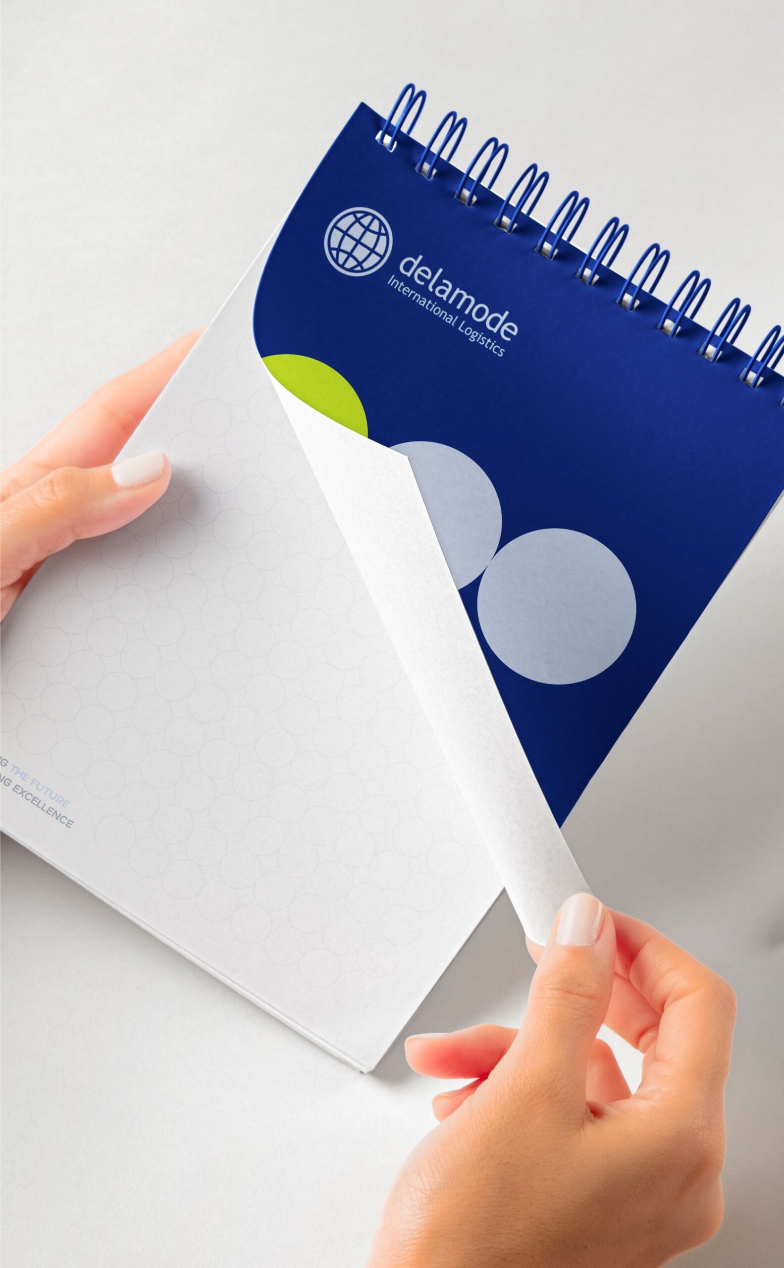
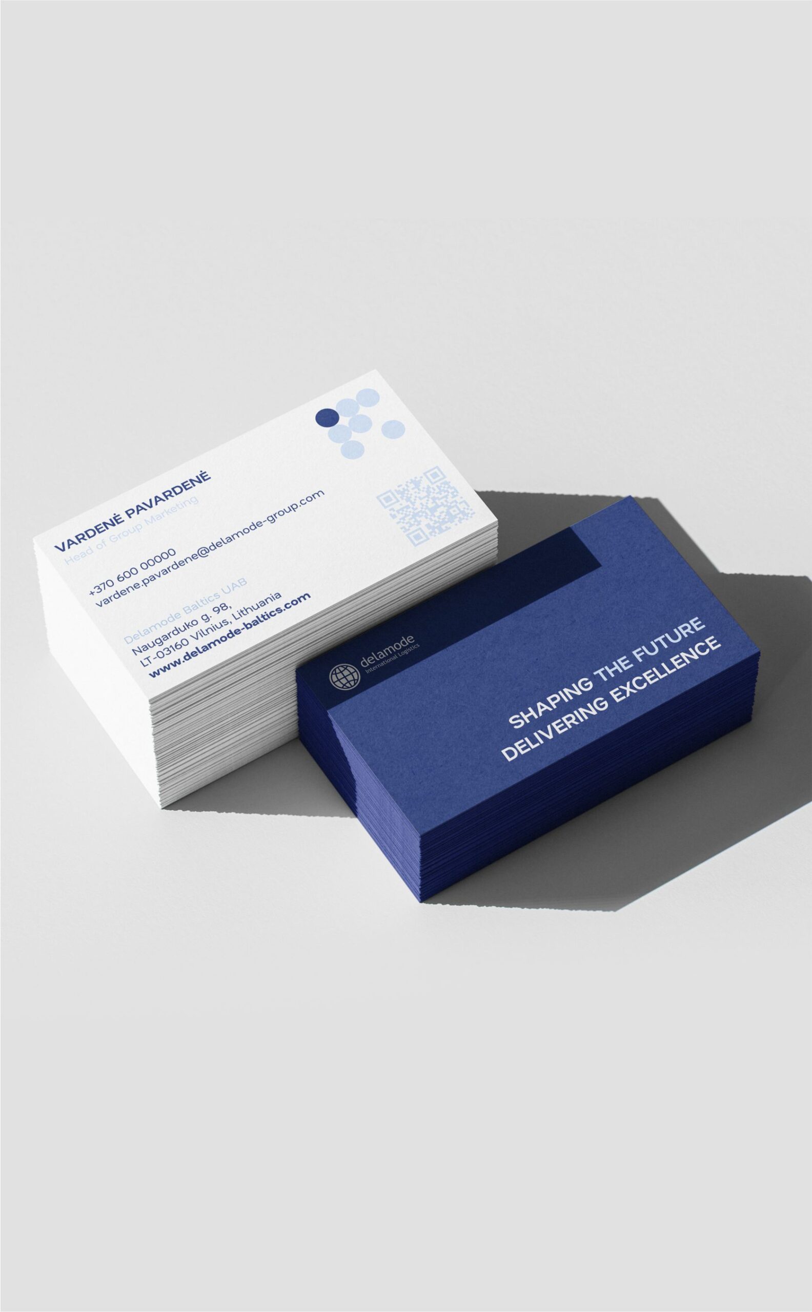
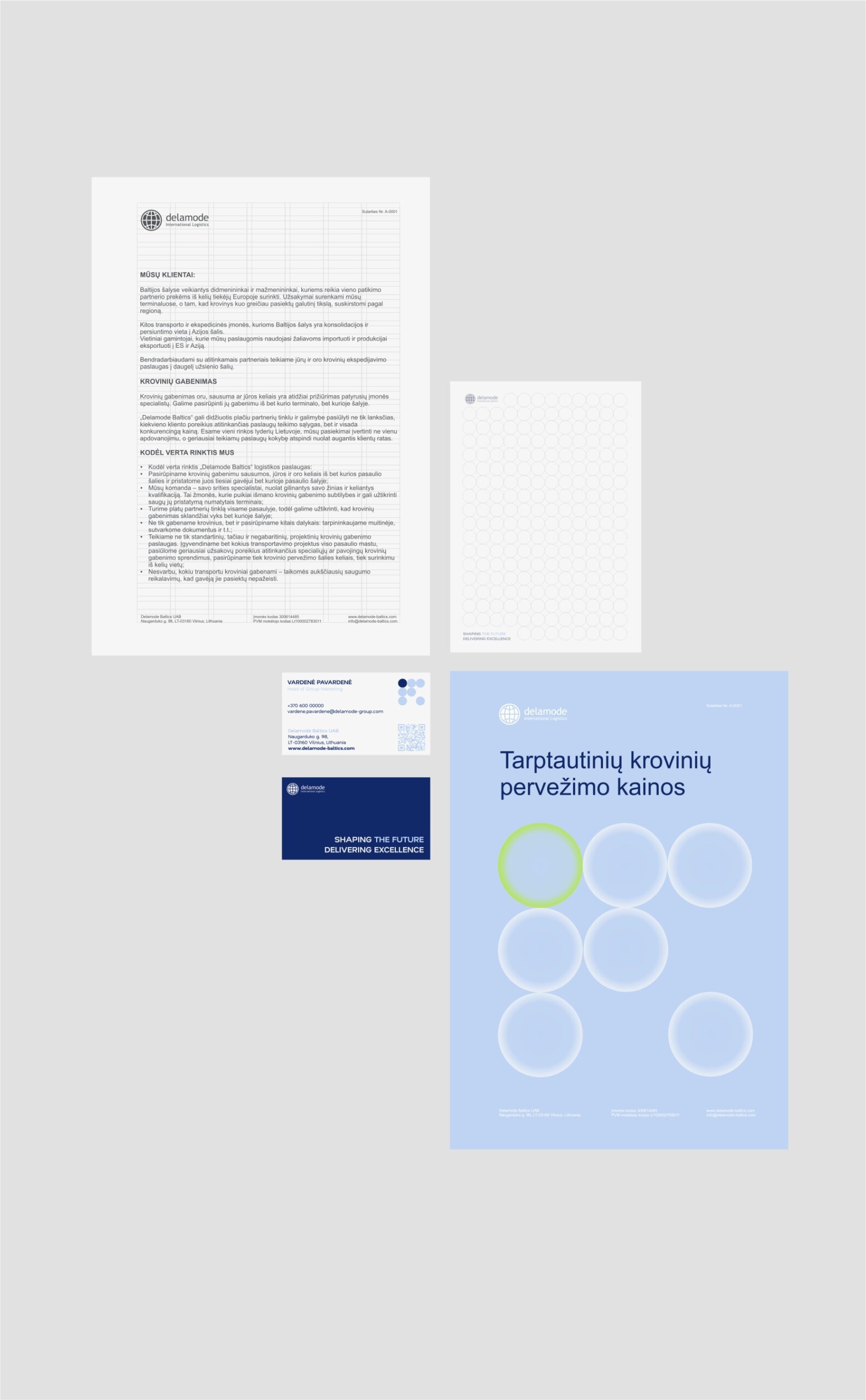
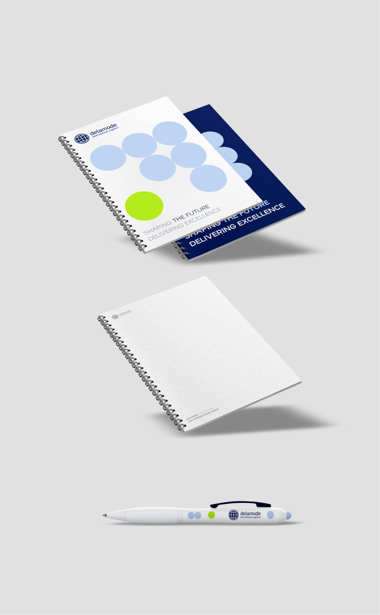
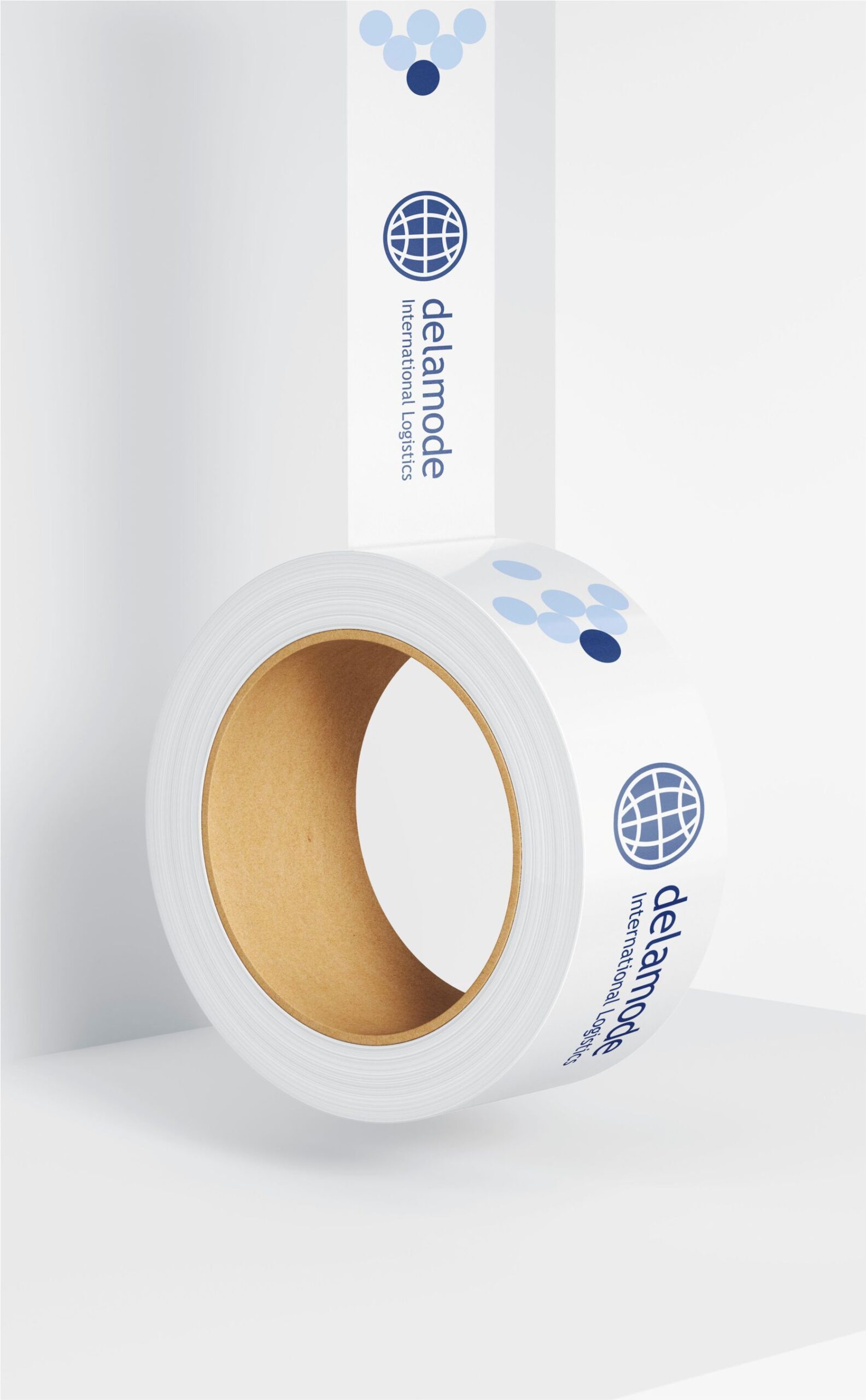
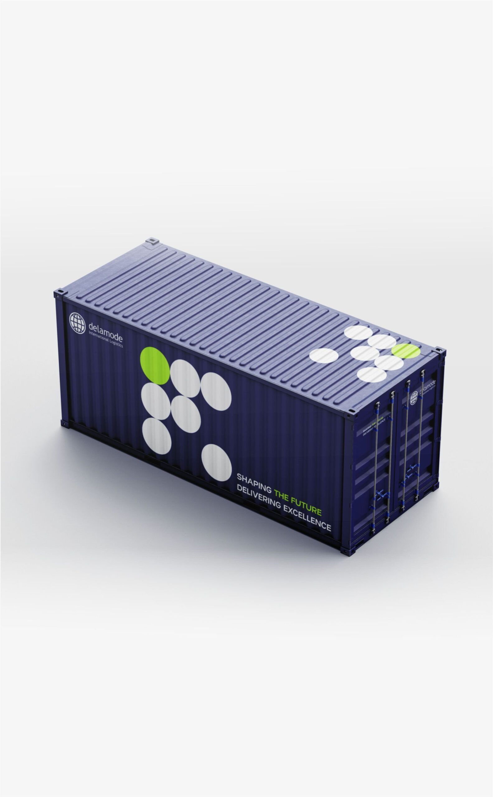
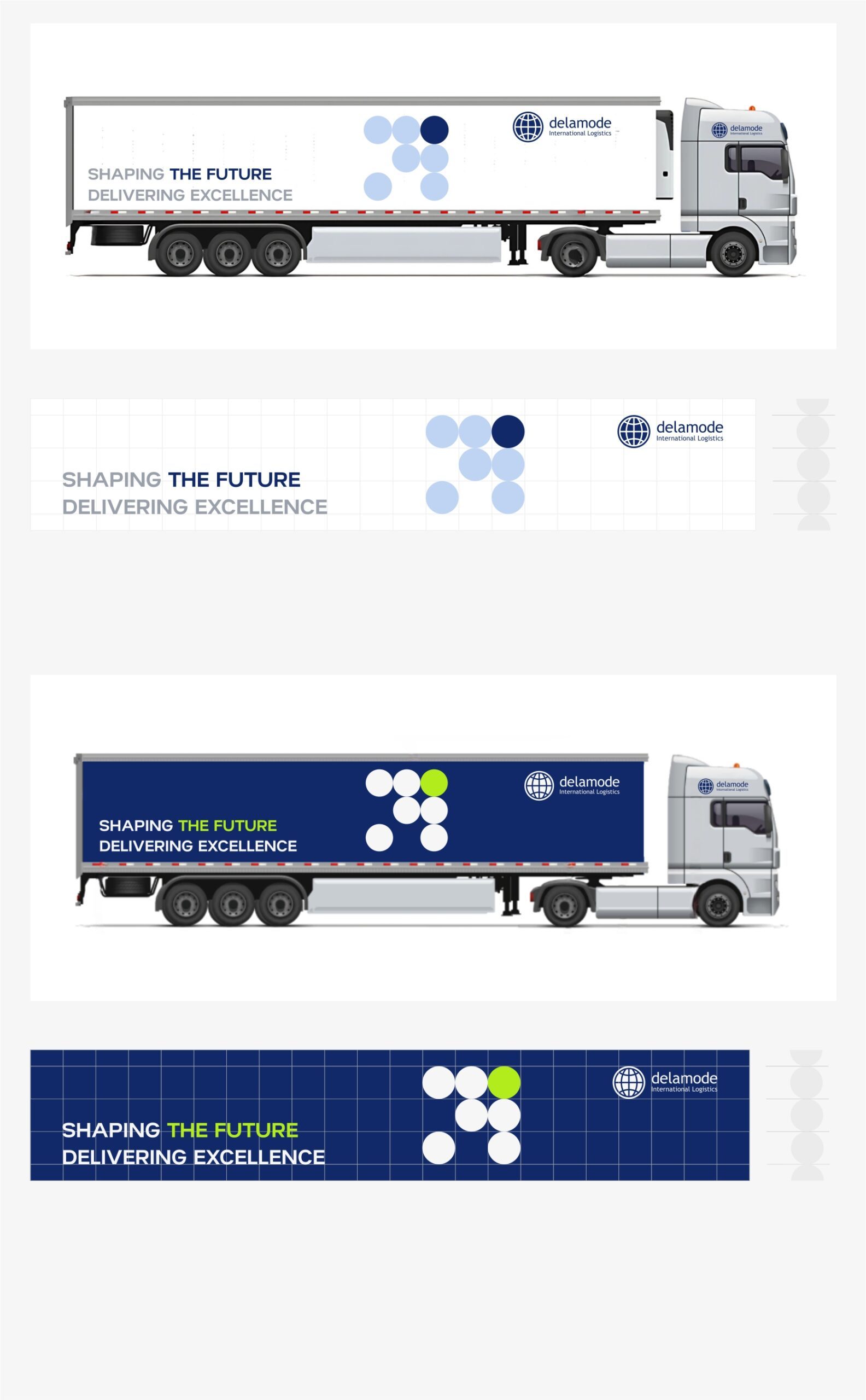
“DELAMODE” rebrand, with the logo preserved. The brand’s visual identity has been thoughtfully refreshed – colors, typography, and all design elements now reflect a modern, cohesive style. A distinctive graphic motif was created: seven circles representing the seven continents, capturing Delamode’s global reach and vision.
This rebrand communicates both heritage and forward-thinking dynamism, making the brand instantly recognizable across all touchpoints. The seven dots represent the seven continents – a clear and simple expression of global reach.
Together, they form an arrow, a symbol of progress, direction, and constant forward movement. This reflects Delamode’s role in driving businesses forward by creating reliable links across markets worldwide. At the top, Europe is highlighted in dark blue. It marks both the company’s origins and its operational hub, the foundation of its identity. Delamode is a European company at its core – built in Europe, serving Europe, and connecting Europe to the world. From this strong base, its wide network extends outward, delivering trusted, efficient logistics solutions.
The company’s primary strength lies in Eastern Europe, where its presence and expertise are unmatched. But its reach is not limited there – it also serves Central, Western, and Southern Europe, ensuring businesses across the continent benefit from its deep regional knowledge, robust infrastructure, and seamless transport links.
One dot, Antarctica, is positioned slightly apart. While not part of Delamode’s delivery network, it acknowledges the seven continents and completes the global picture – reinforcing the company’s vision of connection without limits.